 use Joomla\CMS\Uri\Uri;

Attracting more students to your K-12 private school ensures its success and growth. By implementing effective marketing strategies, you can reach potential students and their families and showcase your school's unique benefits and opportunities.
Here are five tips to help you attract more students to your K-12 private school:

Written By: Adam Bennett | March 01, 2023
Adam is the president and founder of Cube Creative Design and specializes in private school marketing. Since starting the business in 2005, he has created individual relationships with clients in Western North Carolina and across the United States. He places great value on the needs, expectations, and goals of the client.
Creating an SEO strategy for your private school’s marketing efforts is crucial in today’s digital age. With the vast majority of people using search engines like Google to find information, it’s important to ensure your school’s website is visible and easily found by prospective students and their families.
Most private schools I talk to understand the importance of search engine optimization (SEO) and the basic concepts behind it. However, when it comes to creating and implementing an effective and comprehensive content marketing strategy that encompasses a good SEO strategy, it’s harder. Many only want to focus on the keywords their target audience is searching, which only partially works, and doesn’t work well in the long run.
Therefore, in this post, I want to share with you the steps you should take to create an effective SEO strategy for your private school’s marketing efforts.
Written By: Adam Bennett | February 27, 2023
Adam is the president and founder of Cube Creative Design and specializes in private school marketing. Since starting the business in 2005, he has created individual relationships with clients in Western North Carolina and across the United States. He places great value on the needs, expectations, and goals of the client.
There is a famous quote from a keynote that the late Cindy Li said, “We’re all just temporarily abled.”
Before you read any further, please think about that. A profound statement, is it not?
That being said, website accessibility is critical to today’s web design and development. Not only does it ensure that your website is inclusive and usable for people with disabilities, but it can also positively impact your search engine optimization (SEO) efforts.
Disabilities come in all shapes and sizes and are part of being human. According to the World Health Organization (WHO), 1 out of every 6 people worldwide has a significant disability. The US Centers for Disease Control and Prevention (CDC) says that 1 in every 4 adults in the US has some disability. It is also highest in the south.
Vision and Our Perception of Color in Relation to Web Accessibility

Regarding web design and accessibility, the biggest issue is vision and our perception of color. Don’t get me wrong, I am not trying to downplay mobility or hearing issues as they are part of this, but because a website is such a visual medium, let’s focus on that for this post.
How We See Color
Bare with me as we wade into the science of how we see color. The light is reflected back to your eyes when you see something (no pun intended). Within your eyes are two types of light-detecting and responding cells, rods and cones. When you’re in low or dim light, rods are engaged. In brighter conditions, cones are stimulated. There are around 6 million cones and 110 million rods in your eyes, helping send the right information to your brain so it can see clearly.
If you were to see something like a falling autumn leaf, the brain processes the number of cones that were stimulated and the quality of their signal. Once your brain has interpreted those nerve impulses, it sees a color.
If you see the leaf in the light of day, it will appear red, orange, yellow, or green. If you see that same leaf at night, it will just appear as some shade of gray.
Color Is a Matter of Perception
Do you remember the controversy about the dress a few years ago? Was it white and gold or black and blue? While you may have strongly disagreed with someone you know about the color combination, most people sense colors similarly. What you see and perceive as red will be the same as what your friends see and experience as red. Our experiences have everything to do with how we all agree on what color is what.
Your previous visual experiences with items and objects influence your color perception. This is referred to as color consistency. Color constancy ensures that the apparent color of an object remains consistent under changing lighting conditions.
Regarding color impairment or color blindness, approximately 1 out of 200 women and 1 out of every 12 men have it. (Source: Colour Blind Awareness) Those who suffer from it are unaware that the colors they perceive as identical appear differently from others.
While those of us who don’t suffer from this tend to think that we go through life and everything is black and white, like how dogs and cats see it, both are myths. (Source: Color Matters) In reality, it is much more complex, and there are different types of color blindness that influence how someone with the condition sees colors.
Color and Genetics

If you struggle with color blindness, you may or may not be aware that your color vision differs from that of others. Until you have your eyes tested and discover that your color perception is abnormal, the colors you see are natural to you.
Color blindness is typically genetic. A recessive gene determines it on the X chromosome, one of the two sex chromosomes - Y being the other. Approximately 8% of men are color blind, while only 1% of women are. Genes tell us why.
Women have two X chromosomes, while men have an X and a Y. Now, to be colorblind, women must have two copies of the gene. If they have one copy, they can be carriers of the condition without symptoms (this means they may pass it on to their children. Most children get their X chromosome from their mother). Men, on the other hand, will be colorblind if their single X chromosome contains the gene. This is why the condition is much more prevalent among males.
If you are born with color blindness, it will not get better or worse throughout life. It just is. However, it is possible to develop an acquired color blindness. This affects men and women at the same rate. It can be caused by accidents or strokes that damage the retina or specific areas of the brain/eye. Some antibiotics, barbiturates, anti-tuberculosis drugs, high blood pressure medications, and drugs used to treat nervous disorders can also cause acquired color blindness.
What Is Color Blindness Accessibility in Website Design?
Color blindness accessibility in web design and development refers to developing aspects of your website so that those who cannot differentiate the entire color spectrum can still use and enjoy your website as intended. In other words, color accessibility deals with the text color, background color, saturation, patterns, text size, and size-to-contrast ratio.
One way color accessibility is measured is with the Web Content Accessibility Guidelines (WCAG) for contrast and color. There are three levels, A, AA, and AAA, which regulate color definitions, minimum contrast ratios by font size, and other factors. These standards can be used for any type of information on your website - practically anything a user needs to view and navigate.
4 Types of Color Blindness
Red and Green (Protan) Color Blindness
Protan Color Blindness (“pro-tan”) or Red and Green Color Blindness is, by far, the most common form of color blindness. This is caused by a Long Wavelength Light (L) cone abnormality. This is commonly seen as red light and is primarily responsible for seeing red hues.
Additionally, Protan Color Blindness causes a person to see reds, greens, yellows, oranges, and browns similarly. This is especially the case in low-light situations. Another issue is that purple colors appear bluer than purple or pink colors appear gray, especially when they are more reddish pink or salmon in color.
Protan color blindness accounts for approximately 25% of all cases of red-green color blindness.
Blue and Yellow (Tritan or Tritanomaly) Color Blindness
Tritan (“try-tan”) or Tritanomaly is much rarer than red and green colorblindness. Tritan color blindness is usually acquired later in life due to aging eyes, cataracts, glaucoma, age-related macular degeneration, or medical diseases. It is only extremely rare that it is inherited at birth.
Tritan results from a reduced sensitivity in the Short Wavelength Light (S) cone cells, and with this condition, the blue cones aren’t working correctly, so a person will see a rainbow of browns, pinks, and teals. Additionally, people will confuse blue with green and yellow with violet or light gray.
Green and Yellow or Blue and Purple (Deutan) Color Blindness
Deutan Color Blindness (“do-tan”) or Green and Yellow or Blue and Purple Color Blindness are caused by a Medium Wavelength Light (M) cone abnormality. The M cone is generally responsible for the green light. This will cause a person to see more red light and not enough green light.
A person with Deutan Color Blindness may confuse green and yellow or blue and purple colors. Another common symptom is that green traffic lights appear very pale green or even white. Pink and gray or white are also frequently confused, especially if the pink is akin to a light purple.
Black and White (Monochromacy and Achromatopsia) Color Blindness
Monochromacy and Achromatopsia or complete color blindness are extremely rare. People with this condition only see in shades of gray.


Red and Green Color Blindness
Malfunctioning red cone cells


The Advantages of Designing an Accessible Website
Thus far, you have read quite a bit about color, but I also want you to think about this, color accessibility isn’t just for the colorblind.
Consider the last time you visited a website with black writing on a dark gray or navy background. What about one with distracting colors, patterns, or effects that made it difficult to find what you were searching for (Think GeoCities or MySpace)? Did you push on or give up and head back to Google?
According to the annual report by Web Accessibility In Mind (WebAIM), in which they evaluate the top 1 million websites, they determined that nearly 8 out of 10 websites failed to meet the AA minimum contrast ratio, almost 6 out of 10 were missing alternative text (alt text), and 2 out of 10 had improper use of heading tags (h1, h2, h3, etc.).
Here are four of the main reasons you need to ensure your website meets basic accessibility requirements:
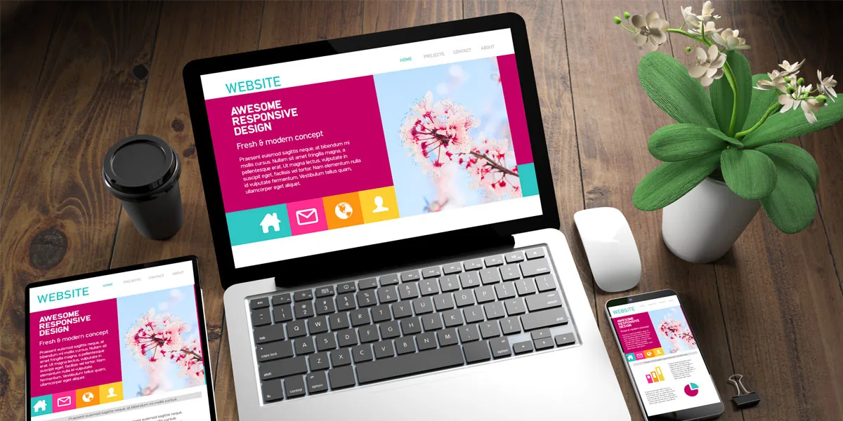
Color Accessibility Improves User Experience
Color accessibility, like all accessibility projects, aims to provide a better experience for people of varying abilities. By focusing on color accessibility, you can drastically improve your user experience. This will help keep prospects on your website, which dramatically increases the likelihood of conversion.
It Is the Right Thing to Do, and It Could Be the Law
Having your website accessible is just as important as having your physical business accessible. By now, most people are vaguely familiar with the Americans With Disabilities Act (ADA). This ensures that people with disabilities can easily access commercial and government buildings.
While back in 1990, we had no idea that we would need to also make concessions for what would become the internet. To plug those, we have to make sure your small business website meets basic accessibility requirements, especially around things like alt text on images, captions on your videos, being able to navigate the website with a keyboard only, and color contrast.
Christopher Schafer at SiteImprove says this about color and color contrast,
Color accessibility (and lack thereof) also has legal implications. Though its roots are in physical locations, Title III of the Americans with Disabilities Act (ADA) can be applied to US businesses whose websites are inaccessible to some people “on the basis of disability.” That includes color blindness, low vision, and other disabilities that can limit someone’s ability to use a website.
When a business fails to comply with accessibility standards on their website, it can leave them open to legal action, like lawsuits, payment of damages, and more from or on behalf of disabled visitors. Consciously designing your website with many accessibility vectors in mind minimizes your chances of violating regulations and experiencing legal trouble.
Consider Screen Readers
Website accessibility isn’t just around color, even though that is a big part of it. Assistive technology such as screen-reader software is sometimes necessary. Therefore you have to write semantic, standards-compliant HTML to improve accessibility. If you want help automating a lot of this, tools like AccessiYes offer a WordPress accessibility overlay that handles many of these fixes for you.
What is Semantic HTML?
Semantic HTML refers to using HTML markup to reinforce the meaning of the content rather than just presenting it. Semantic HTML uses HTML elements such as header tags (h1, h2, h3, h3, h4, h5, and h6.), paragraphs (p), lists (ul, ol, li), and more to give structure to the content and indicate its meaning to both the reader and search engines.
On the other hand, Standards-compliant HTML refers to using HTML that conforms to the W3C (World Wide Web Consortium) standards. Following these standards ensures that web content is accessible, usable, and compatible across devices, browsers, and screen readers.
More About Screen Readers
Additionally, a blind person using a screen reader needs to be able to skip through different sections of the page rather than reading the whole page from start to finish. Using heading levels appropriately makes this a lot easier. The user can listen to all the section headings and decide which part of the page they are interested in.
Keeping the content and presentation layers separated is also incredibly important. HTML is for content and structure, and CSS is for presentation and layout.
It Can Help With Your SEO
Using accessible design best practices has a lot of benefits for your website beyond just helping visitors.
To start, I want you to think about how a blind person or one with low vision. People with this disability would be using a screen reader. A screen reader will go down the page and read your images’ text and the alt text. Therefore ask yourself these questions:
- Is there enough text on the page to describe what the topic is?
- Do the images have alt text that describes them, or do they say something like “img_867-5309.jpg?”
- Are you using proper headings and subheadings, and are they in the correct order?
When it comes to Google and the search engines, they come to a page on your website and render that page. They are looking at the overall content and the layout. They will also look at your headings, text, images, and the underlying HTML code of your website. While Google can now see your images, it still looks at the alt text of the images to help learn what it is or what it’s an image of.
Avoid These 25 Things to Keep Your Site Accessible and What to Do Instead
When it comes to your website, it doesn’t take much to render a web page useless to some visitors. Here are 25 things to avoid and what you should do instead.
- Avoid using text that is too small or too close together: These are two of the most common mobile usability issues. Not only are they hard for “enabled individuals,” they can be extremely hard for someone who may be disabled.
- Avoid elements with low color contrast: This causes issues because someone without a full range of color sensitivity can’t distinguish the element. Images, GIFs, videos, graphs, charts, and other visuals that might give your website a little flair can keep some visitors away for the same reason.
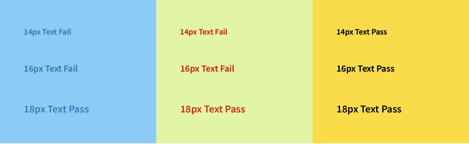
- Avoid having text that couldn’t pass accessibility guidelines: You should check the combination of text color, background color, and text size against the WCAG 2.0 level AA standards. This standard requires a minimum contrast ratio of 4.5:1 for normal text and 3:1 for large text.
- Text readability is critical to creating a web page everyone can understand. Everything about the text on your website, from the typeface and font to the style and size, can make it difficult to read. Modifiers such as italicization, bolding, kerning, spacing, serifs, and others can improve or degrade the user experience for visitors of all skill levels.
- Text overlays on images aren’t discernable to all visitors. Words on an image or photo nearly always compete for attention with the image's content, whether it's live text or baked into the image file.
- Avoid using images as text. This can make it difficult for users with visual impairments to understand the content of your website.
- Don’t use images to convey important information: Screen readers cannot read text within images, so it’s essential to use alternative text to describe the content of images.
- Avoid having photographs or images without proper descriptions or alt text.
- Don’t create confusing or misleading links: Links should be clear and descriptive, so users know what they’re clicking on and where they’ll be taken.
- Avoid using non-descriptive links, such as “click here.”
- Avoid using color combinations that make text difficult to read, blinking, or flashing text.
- A colorblind visitor can completely miss in-text hyperlinks. Some sites’ CSS styles don’t make it clear that text contains a link. Some only change color when visitors hover over them with their mouse pointer, which isn’t enough for colorblind or mobile visitors.
- Issues, errors, and warnings can’t rely only on color alone. If a visitor misses a field on a website form, hits “submit,” and the field’s text or outline changes from black to red, that isn’t enough to inform them what’s wrong or how to rectify it.
- Form placeholders with low color contrast might just look like text. The same principles apply to text that appears in forms. With high color contrast and other non-text features, websites must make it plain to all users that a form is intended to be entered in or responded to.
- Avoid using tables for layout. While tables might have been our go-to method for formatting a page in the late 90s and early 00s, now tables should only be used to present tabular data. Using tables for layout can make it difficult for users with disabilities and assistive technologies to understand the content and structure of your website.
- Avoid using JavaScript events as the only way to trigger an action. This can make it difficult for users with assistive technologies to understand what is happening on your website.
- Avoid using CAPTCHA. These can be difficult or impossible for users with visual impairments or cognitive disabilities to complete.
- Don’t create pages with broken links or missing images: Broken links and missing images can make it difficult for users to navigate your site and can harm your search engine ranking.
- Avoid using auto-playing audio or video.
- Avoid using pop-ups.
- Avoid using non-standard navigation elements.
- Avoid using complex or confusing content structures.
- Avoid using just color to distinguish primary buttons. Use placement, size, borders, icons, boldness, contrast, and anything else to help users determine them.
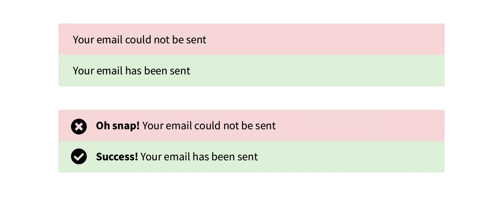
- Avoid “green” and “red” alert messages. Success and error messages are frequently colored or shaded green and red, respectively. As mentioned before, most colorblind people have trouble with green and red. Therefore they will automatically correlate different hues with distinct meanings. However, utilizing prefix text such as “Success,” “Error,” “Warning, ” or including an icon makes it quick and easy for anyone to understand.
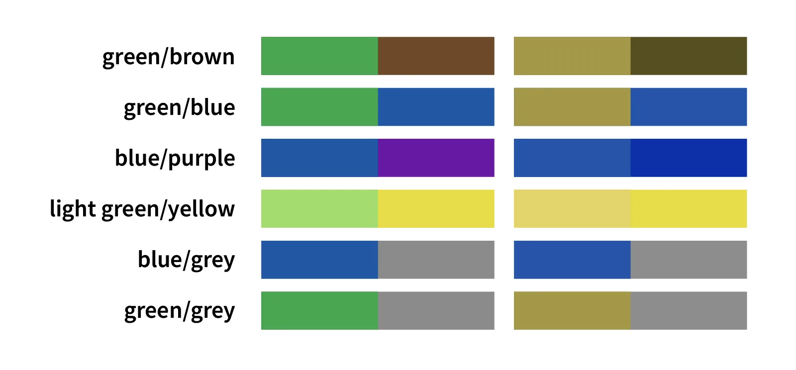
- Avoid having these color combinations when possible:
- green/red
- green/brown
- blue/purple
- green/blue
- light green/yellow
- blue/gray
- green/gray
- green/black


Final Thoughts
Website accessibility is essential for all aspects of the user experience as it makes websites inclusive and usable for everyone and helps drastically improve your SEO efforts.
The tips I shared in this post are not exhaustive and may not apply to your situation. However, they cover the majority of problems many people experience when using websites.
Contact me today if you want to know more about your website’s performance and possible recommendations. I would be happy to look at your site and give you some honest feedback.
Written By: Adam Bennett | February 23, 2023
Adam is the president and founder of Cube Creative Design and specializes in private school marketing. Since starting the business in 2005, he has created individual relationships with clients in Western North Carolina and across the United States. He places great value on the needs, expectations, and goals of the client.
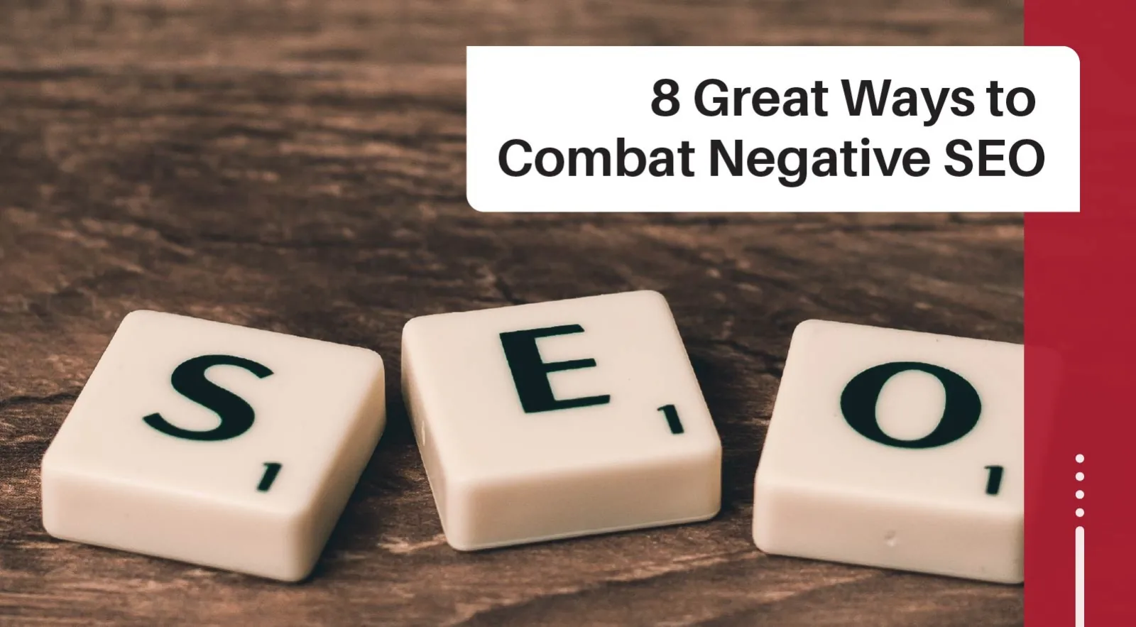
Most people use gadgets, tablets, laptops, and smartphones to browse the Internet. That makes your website’s SEO more important than ever before. However, if you are a victim of negative SEO or on the unfortunate end of a Google algorithm update that has severely penalized your site on the search engine page rankings for any keyword you’re trying to rank for, things can look bleak.
The goal of Search Engine Optimization (SEO) is to improve the ranking of your website in search engines. The higher you are in Google’s first ten listings, the more traffic you’ll get.
Many components go into SEO, including title tags, meta descriptions, keyword research and usage, images, and alt text. However, not all factors play an equal role in determining your rank for any particular keyword or phrase. Understanding how each element affects your ranking can help you make better decisions about spending time on a good SEO strategy.

Written By: Chad J. Treadway | February 20, 2023
Chad is our Chief Smarketing Officer. He will help you survey your small business needs, educating you on your options before suggesting any solution. Chad is passionate about rural marketing in the United States and North Carolina. He also has several certifications through HubSpot to better assist you with your internet and inbound marketing.
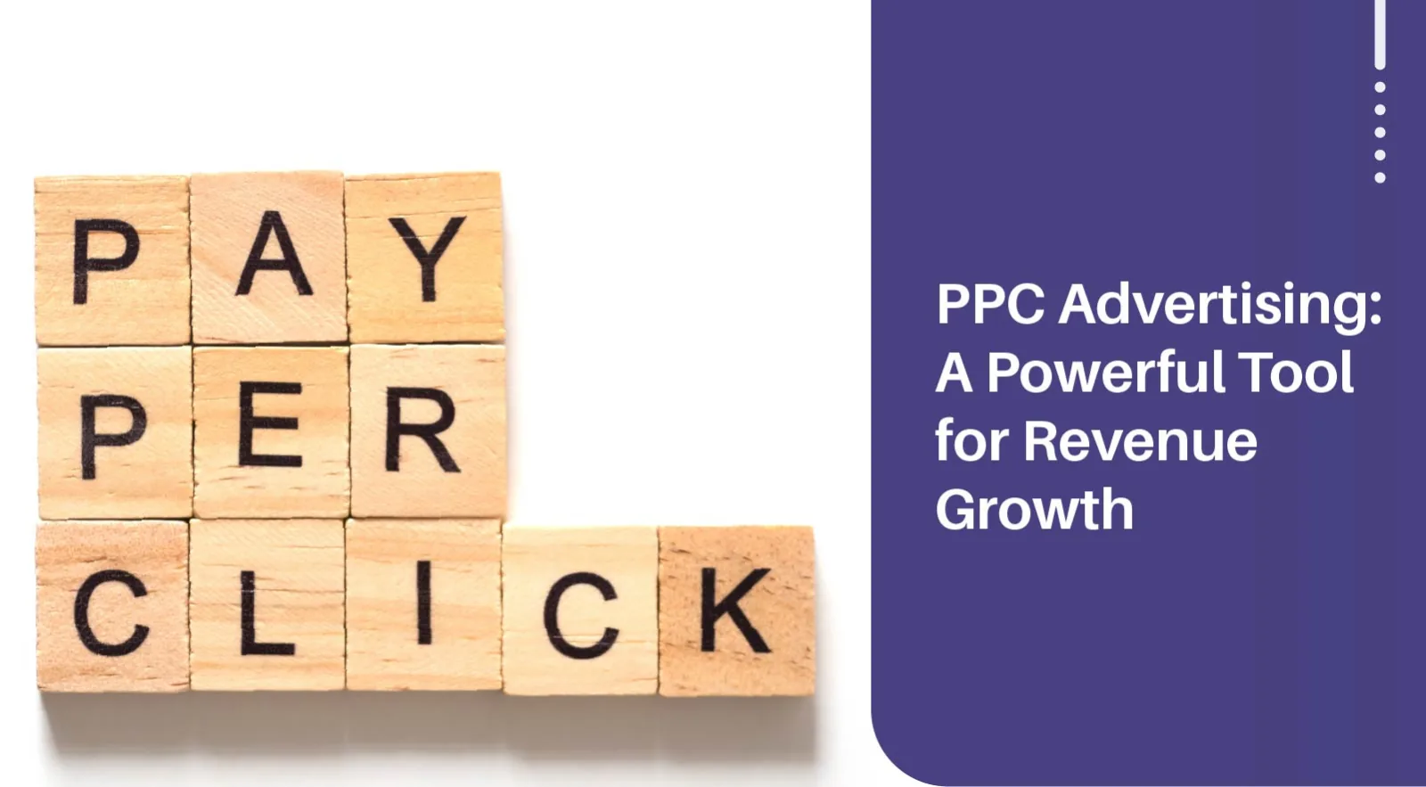
Are you tired of seeing stagnant revenue growth in your business? Are you looking for a way to increase your revenue quickly? If you answered yes, then you may want to consider pay-per-click (PPC) advertising.
In this post, we’ll explore what PPC ads are, their benefits, how to create an effective campaign, and common mistakes to avoid. So, buckle up, buttercup, and get ready to learn how to grow your small business level with PPC ads.
Written By: Chad J. Treadway | February 17, 2023
Chad is our Chief Smarketing Officer. He will help you survey your small business needs, educating you on your options before suggesting any solution. Chad is passionate about rural marketing in the United States and North Carolina. He also has several certifications through HubSpot to better assist you with your internet and inbound marketing.

Increasing enrollment and retaining students at a private school can be a challenge. With so many available options, it can be difficult to stand out and convince families to choose your school. However, with the right strategies in place, you can increase enrollment and continue to secure the future of your school.
Here are seven effective ways to boost enrollment at your private school:
Written By: Adam Bennett | February 15, 2023
Adam is the president and founder of Cube Creative Design and specializes in private school marketing. Since starting the business in 2005, he has created individual relationships with clients in Western North Carolina and across the United States. He places great value on the needs, expectations, and goals of the client.

Social media has become a crucial platform for marketing and promoting small businesses, organizations, and especially educational institutions in today's digital age. For private schools, social media provides a powerful opportunity to reach a large and diverse audience of students and families, increase enrollment, and build a strong online presence.
However, with so many different platforms and strategies, it can be challenging to know where to start.
This blog post will explore proven strategies for marketing a private school on social media. Whether you're a seasoned social media marketing pro or just starting, these tips will help you maximize your impact and reach your goals.
Written By: Adam Bennett | February 13, 2023
Adam is the president and founder of Cube Creative Design and specializes in private school marketing. Since starting the business in 2005, he has created individual relationships with clients in Western North Carolina and across the United States. He places great value on the needs, expectations, and goals of the client.
As a private school administrator, you know the importance of promoting your institution to reach a wider audience and attract potential students and their families. But you may wonder where you can and should advertise your private school. The right advertising strategy can help you reach your audience, increase school brand awareness, and drive enrollment. In this article, we’ll explore some of the most effective ways to advertise your private school online and offline.
Written By: Adam Bennett | February 08, 2023
Adam is the president and founder of Cube Creative Design and specializes in private school marketing. Since starting the business in 2005, he has created individual relationships with clients in Western North Carolina and across the United States. He places great value on the needs, expectations, and goals of the client.
You and I both know that every private school has its “unsung heroes,” like the custodians, instructional aides, volunteers, and community partners. Just as these individuals work behind the scenes to ensure that your school runs smoothly and that students have the resources they need to succeed, backlinks are the unsung heroes of the web.
But what are backlinks? You want to think of a backlink like a vote for your private school website. When another website has a link to your website, such as a community partner or "mommy blog," it's like they're saying, "this website is good, and people should check it out." The more votes (backlinks) a website has, the more popular it is and the higher it will appear in search engines like Google. Think of it like a popularity contest online. The website with the most votes (backlinks) wins!
I say they are the unsung heroes because they play a crucial role in how search engines like Google determine the relevance and authority of your website. This goes back to the Expertise, Authority, and Trustworthiness (E-A-T) that Google is looking for.
This post will delve into the world of backlinks, explaining what they are, why they're important, which kind will help your Google Ranking, good and bad link practices, and strategies for generating backlinks for your private school.
Written By: Adam Bennett | February 06, 2023
Adam is the president and founder of Cube Creative Design and specializes in private school marketing. Since starting the business in 2005, he has created individual relationships with clients in Western North Carolina and across the United States. He places great value on the needs, expectations, and goals of the client.

Click-through rate (CTR) is an important metric in digital marketing. It measures how many people actually take action after seeing your advertisement, and it’s often the deciding factor in whether an advertising campaign is successful or not.
If your CTR is low, it means that your audience is not engaging with your content.
Fortunately, there are plenty of ways to improve your CTR, and in this article we’ll provide some tips that can help you increase your click-through rate.
We’ll look at how to optimize your content for higher engagement, how to create compelling visuals to draw attention to your message, and how to use A/B testing to better understand what works and what doesn’t.
Do you find yourself so overwhelmed with the day-to-day operations of your business that social media marketing takes the back burner? Whether you are a small marketing team or the sole proprietor of any small business, you are probably familiar with having to wear multiple hats to keep your business running, however, I wouldn't write off social media so promptly, no matter how hectic things can get at times.
In this day and age, the internet has become a way of life, with more and more people worldwide who can access it anytime, anywhere, on their phones. Americans spend an average of 5 hours and 30 minutes daily on their phones (Source: Zdnet), which is the same as driving from Asheville to Wilmington, NC. By 2025, it is predicted that there will be over three smartphone users for every five people in the USA alone (Source: Statista).
Till not so long ago, apps were a rarity. The average person uses a minimum of 9 apps daily and 30 apps monthly (Source: Buildfire). Apps and social media have given people more ways to engage with a brand, making apps ideal marketing vehicles to develop new sales and help businesses address evolving client needs. There are 302.35 million social media users in the US alone, meaning 90% of the US uses social media. (Source: Demandsage.com) Hence, there is a good chance your clients and prospects are already waiting to hear from you, which is why effective social media marketing for small businesses is necessary.
These numbers alone clearly indicate that social media is a fertile and powerful platform for small business social media marketing. Grow your brand, connect directly with your audience, and build brand awareness and brand loyalty with an innovative social media strategy for small businesses.
Social media is, without a doubt, the most effective platform for lead generation, enabling businesses to create content and resources resulting in added value for their prospects and clients. When people click on your social media post or offer, they are engaging and opting in to stay updated by following your business online, and these are more likely to convert.
What if I told you there is a simple, effective approach to social media marketing for a small business? Social media is a free, simple, and powerful tool for small businesses to connect directly with people interested in their brand. However, a little thought and strategy go a long way, so before you start posting, you'll need to set up a social media marketing strategy.

Written By: Hannah Kilpatrick | February 01, 2023
Hannah Kilpatrick Cube Creative DesignHannah Kilpatrick graduated from Western Carolina University in 2021 with a Bachelor of Science in Communication with a Minor in Marketing and a Concentration in Public Relations. She has been around social media since its creation. (Meaning, she was in the first grade when Facebook became available to the general public.) As our very own professional Gen-Z, Hannah is a whiz when it comes to social media creation and paid advertising.
As the clock struck midnight and the ball dropped in Times Square, New York City, on January 1st, many of us eagerly made resolutions to improve ourselves in the coming year. Fast forward a few weeks, and it's already clear that some of these resolutions may have been a bit too ambitious. From promising to give up certain foods or vowing to hit the gym daily, it's easy to lose sight of our goals. But let's be honest; it's not the end of the world if we stumble along the way. In fact, it's almost expected. So let's take a moment to laugh at ourselves and our failed resolutions and remember that it's always okay to start again.
With that being said, words have the power to inspire, uplift, and motivate us to be our best selves. In times of difficulty, a simple quote can encourage us to keep going. An inspirational quote can remind us or those who read it of their strength and potential. They can also remind us never to give up on our dreams or resolutions.
Regardless of the circumstances, here are 52 inspirational quotes that you can use to share on your social media feeds.
Written By: Hannah Kilpatrick | January 30, 2023
Hannah Kilpatrick Cube Creative DesignHannah Kilpatrick graduated from Western Carolina University in 2021 with a Bachelor of Science in Communication with a Minor in Marketing and a Concentration in Public Relations. She has been around social media since its creation. (Meaning, she was in the first grade when Facebook became available to the general public.) As our very own professional Gen-Z, Hannah is a whiz when it comes to social media creation and paid advertising.